The first edition of Donald Knuth’s book Seminumerical Algorithms (Volume 2 of The Art of Computer Programming) came out in 1969. It was published by Addison-Wesley,1 and had been typeset with hot metal typesetting.2 Its first few pages looked like this:
(TODO: add scanned images)
In 1977, the second edition of the book was being prepared. The publishers had changed their process from hot metal typesetting to phototypesetting, and when Knuth received the galley proofs he was disappointed with the quality of the fonts.
(Images from Digital Typography. Before: first edition. After: the publishers' galley proofs. Note for instance the “ff” in “effect”. The difference is hard to tell on a computer screen, and easier to tell at real size on the printed page.)
I didn’t know what to do. I had spent 15 years writing those books, but if they were going to look awful I didn‟t want to write any more.
Meanwhile, he had recently seen a book3 that was typeset with neither hot metal typesetting (where the shape of each character was made out of physical pieces of lead) nor phototypesetting (where the shape of each character was determined using light and lenses somehow), but with digital type (where the shape of each character was determined by a set of pixels).
(TODO: replace with “cleaner” e.g. SVG image)
He decided that as a computer scientist, faced with the problem of determining a pattern of 0s and 1s, he could solve the problem himself.4
Imagine a page of 6×9 inches at say 1000 dots per inch. Then the problem of specifying the appearance of the page is that of deciding, among these 54 million (6000×9000) dots, which dots are 0s and which are 1s. If you start trying to think how you’d decide this, you’ll probably soon realize that, for example, every time there’s an “e” on the page (in a particular font, i.e. a particular typeface at a particular size, weight and style), the same pattern of dots repeats locally. That is, we can “factor” the problem into two problems:
The problem of determining what the pattern of dots should be, for every character in every font (i.e. defining the font itself), and
The problem of determining how these patterns for individual characters (along with simple patterns of dots representing lines, aka rules) should be arranged (set) on the page (setting type, aka typesetting).
(Ultimately, Knuth would write METAFONT to solve the former problem, and TeX to solve the latter.5 In the rest of this page, we focus on the former.)
Now, if we already have a font on paper (as Knuth did from the first edition of the book above), then you might imagine that the straightforward way to “digitize” the already existing font would be to simply “copy” the shape of each character directly somehow. And in fact that’s what Knuth tried to do at first, with a television camera and later by projecting photographs. It turns out to be hard, and was even harder then with lower-resolution devices.
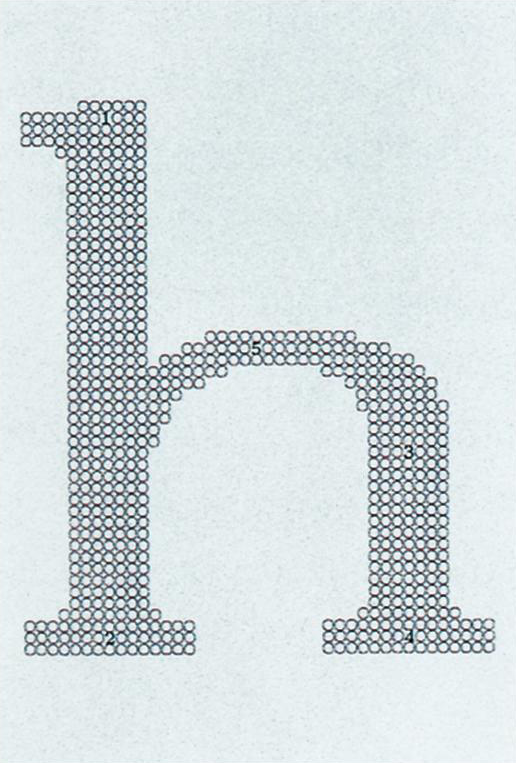
As he was working on this, Knuth must have noticed things, such as that the different shapes were not entirely arbitrary; there was some uniformity to the design. For example if I view the lowercase alphabet in Helvetica that comes with macOS at a really large font size in TextEdit, it appears that, although of course not all letters have the same width, they are also not entirely arbitrary, and fall into a few equivalence classes: in increasing order of width, they seem to be:
Moreover, you can see that for example the three vertical segments in “m” appear to be equally spaced, that the first pair are similar to that in “n”, etc. Also of course the “p”, “q”, “b”, “d” probably need similar loops. The serifs in “n” and “u” may be similar. Etc. These don’t happen by accident.
Such basic observations must have led Knuth to his idea.
Finally, a simple thought struck me. Those letters were designed by people. If I could understand what those people had in their minds when they were drawing the letters, then I could program a computer to carry out the same ideas. Instead of merely copying the form of the letters, my new goal was therefore to copy the intelligence underlying that form. I decided to learn what type designers knew, and to teach that knowledge to a computer.
Here are examples of the idea at work.
(TODO: Add animated or interactive images of an example, maybe the “A” from Knuth with regular/bold/typewriter.)
After he had been working on this a few years (but still before had started work on the Pascal/WEB rewrite of METAFONT, i.e. when METAFONT was still written in the SAIL language local to the Stanford AI Laboratory), in Volume 16, Issue 1 (January 1982) of the journal Visible Language, Knuth published his remarkable article The Concept of a Meta-Font. It is available online (abstract, PDF/alt PDF).
The abstract:
A single drawing of a single letter reveals only a small part of what was in the designer’s mind when that letter was drawn. But when precise instructions are given about how to make such a drawing, the intelligence of that letter can be captured in a way that permits us to obtain an infinite variety of related letters from the same specification. Instead of merely describing a single letter, such instructions explain how that letter would change its shape if other parameters of the design were changed. Thus an entire font of letters and other symbols can be specified so that each character adapts itself to varying conditions in an appropriate way. Initial experiments with a precise language for pen motions suggest strongly that the font designer of the future should not simply design isolated alphabets; the challenge will be to explain exactly how each design should adapt itself gracefully to a wide range of changes in the specification. This paper gives examples of a meta-font and explains the changeable parameters in its design.
Note that the article is about the idea of a meta-font in general, not about the specific METAFONT program.
The article is a virtuoso performance, and later I’ll edit this page to discuss some of it.
How Knuth’s article came to be published is explained 3 issues later, in Volume 16, Issue 4 (October 1982).
Visible Language has a long history of special interest in computer-assisted design of letterforms. A few months after the first issue appeared in January 1967 I walked across the street from my office to the Department of Computer Science at Case Western Reserve University to see if I could arouse any interest in research on the design of typefaces. Graduate student Paul Vargo was indeed interested and under the direction of his faculty advisor, Harry Mergler, produced as his doctoral dissertation the first computer system for parametric letter design. The results were published in this journal (then The Journal of Typographic Research) the following year. It was an introductory study and handicapped by equipment limitations of the mid-1960s. In essence, it was an idea whose time had not yet come.
Fourteen years later - in early 1981 - I walked across the street again to meet and talk with Donald Knuth about Meta-Font. By coincidence, Knuth is an alumnus of Case Western Reserve University but was graduated years before Paul Vargo and unaware of his research. I suggested to Knuth that when he was ready to present his ideas to the graphic design audience, he should use the pages of Visible Language. He agreed, and “The Concept of a Meta-Font” was published earlier this year.
It occurred to the editors that it might be valuable to follow-up publication with a survey of those most knowledgeable and most experienced in type font generation, asking for reactions and ideas on the meta-font concept and/or on computer-assisted letter design in general.
The article/response by Douglas R. Hofstadter which begins on the opposite page is followed by letters from type designers, graphic designers, and others in the graphic arts field - with a final response from Donald Knuth. The editors thank all of the respondents for their thoughtful replies. The lack of concensus at this stage of developing the meta-font concept is most heartening!
A few copies of the issues containing Knuth’s article (Winter 1982) and the Mergler/Vargo article (Autumn 1968) are still available. To order, see the previous page.
M.E.W. [Merald E. Wrolstad]
As mentioned, this is followed by an article by Hofstadter (p. 309), which I’ll later edit this page to discuss. For now, let me just say that taken in isolation and as an independent contribution it is in its own way delightful in a typical Hofstadter way, but as a response to Knuth’s article it is simply inane and frustratingly strawmanning. More on that later.
Anyway, Hofstadter’s article is followed by various letters/reactions from various people, as mentioned. As they are in a hard-to-read format in the PDF (continuing across columns on different pages), I’ve copied them here. They span pages 339 to 359, and are arranged as follows:
page 339:
    Baudin    Bigelow
page 340:
    Baudin    Bigelow
page 341:
    Baudin    Bigelow
    Bronsard
page 342:
    Bronsard  Bigelow
page 343:
    Bronsard  Bigelow
              Fisher
page 344:
    Bronsard
    Ford      Fisher
page 345:
    Ford      Fisher
    Gore
page 346:
    Gore      Jaspert
    Karow     Kapr
page 347:
    Karow     Kapr
page 348:
    Karow     Kapr
page 349:
    Nesbitt   Kapr
page 350:
    Nesbitt   Kapr
              Rondthaler
page 351:
    Nesbitt   Rondthaler
page 352:
    Nesbitt   Rondthaler
    Schappler
page 353:
    Schappler Rondthaler
    Unger     Tracy
page 354:
    Unger     Tracy
page 355:
    Unger     Tracy
    (and figure)
page 356:
        <Unger>
        <Zapf>
page 357:
        <Zapf>
page 358:
        <Zapf>
        <DEK>
page 359:
        <DEK>
If we were to put them in order by the highest position at which a letter starts (breaking the tie at rank 1 by declaring that left column ranks earlier than right column), I might do it as follows:
Here they are.
The first is by Baudin (p. 339 left column):
To the Editor:
I am thankful for the opportunity to welcome a major contribution not only to the pages of this journal but also to the history of written interchange.
A few years ago I was staying with a couple of journalists in Washington. Knowing my interests they showed me a press release from Stanford University announcing Donald Knuth’s Meta-Font. No mathematics were needed to understand that Knuth is a mathematician grown definitely exasperated with the shortcomings of composing techniques for mathematical proceedings. Mathematics, not Latin, being the universal language for scientists today, he determined to find a mathematical yet practical solution to the problems of technical composition in general.
It is important to note that before he set out to work he first consulted the appropriate historical sources as well as a number of distinguished contemporary type designers. In due time (1979) he published a series of articles in the Bulletin of the American Mathematical Society. The article in Visible Language is expressly intended to bring the ideas of a meta-font home to a public of generalists, if not to the general public.
The result is not pleasant to look at. Nor is it intended to please the eye. It is not a poem; it is a prosody. Not to be read, but to be studied. It is a methodic demonstration of a meta-font and the interchangeable parameters on its design. Not at all intended to set any typographic standards while pointing out the “lamentable degradation” of quality in current practice.
Again, it is important to note that in his conclusion he turns to the type designers as “the professionals who really know the subject,” hoping they will begin to create metafonts in their own explicit language. Let the type designers and the type manufacturers speak for themselves. What I would like to say as a teacher of letterforms is the following.
Knuth’s attitude may well be as significant as the results of his research. It clearly indicates that to him letterforms and letterform design are major factors, not mere variables or interchangeable parameters in the cultural system of any literate civilization today.
It would seem to me that Knuth’s attitude and the resulting Meta-Font is in keeping with the developing school of systemic thought (as represented in French by E. Morin and in English by Bronowski and Laszlo, to name a few). There may be some hope that a new philosophy of education will soon emerge along the same systemic lines to meet the challenge of the steadily oncoming technologies and the resulting waves on the ocean of human history. There is also some reason then to hope that writing, in the sense of written interchange, will at long last be considered for what it has always been, namely: one continuity of related and interconnected systems co-extensive with human history and constituting the very nervous network of any future social life on this planet.
Fernand Baudin
64 rue du Village
5983 Bonlez, Belgium
The second6 is by Bigelow (p. 339 right column). He shows that “Donald Knuth’s Meta-Font is firmly within the typographic tradition”:
To the Editor:
The Greek word “meta-” is derived from the proto-Indo-European prefix *me-, meaning “in the middle of,” related to English “mid-.” It would therefore be appropriate if Donald Knuth found himself in the midst of a controversy over his “concept of a Meta-Font” (a situation which he would no doubt enjoy).
The fundamental idea of a meta-font, indepehdent of a modern cybernetic materialization of it, has been a common theme in the history of typography. In fact, if we wished to adopt a teleological bias, we could claim that a major force in typographic evolution has been the progressive exfoliation of the meta-ness of meta-fonts.
In this view, French typography in the second half of the sixteenth century can be seen as devoted to the expansion of Claude Garamond’s quintessential roman typeforms throughout a complete range of body sizes, from the small nonpareil to the large canon. This triumph of design in the dimension of “scale” (size) - today a trivial problem - was an enormous undertaking for traditional punch-cutting technology. Many of the sizes were cut by Garamond himself, but many were also accomplished by the hands of other punch-cutters working in Garamond’s idiom: Guillaume Le Be, Robert Granjon, Pierre Haultin, Jacques Sabon.
During the same period, the roman and italic forms, distinct entities in Aldine typography, were mated into a single family. The roman became the dominant text form, semiologically unmarked, and the italic became the subordinate form, semiologically marked, to signify difference, emphasis, contrast, etc. Thus, two originally rival forms became united in structural opposition as distinctive features of the text image. Robert Granjon established the dominant style of italic by cutting several sizes of his “pendante” form to mate with Garamond romans.
Toward the end of the sixteenth century, the Antwerp printer Christopher Plantin began the exploration of yet another dimension of meta-font: the relation of x-height to body size. Plan tin commissioned re-cuttings of Garamond-style fonts to have shorter ascenders and descenders for use on a smaller body. Robert Granjon and Hendrik van den Keere both cut these large x-height variants for Plantin, in sizes including cicero, philosophie, and colineus by Granjon and canon and texte by Van den Keere.
In seventeenth-century Holland the amalgamation of roman and italic was furthered by the trend for a single punch-cutter to cut both roman and italic forms, precisely harmonized in body size, alignment, and color. The types of Christoffel van Dijk and Totfalusi Kis Miklos are examples.
In the mid- to late eighteenth century Pierre-Simon Fournier cut several variations of both roman and italic for each of the major body sizes. The dimensions of Fournier’s meta-fonts included x-height, width, and weight, as well as roman and italic, and size. For the cicero body, Fournier cut ten variations, seven roman and three italic. Following Fournier, Giambattista Bodoni cut an even greater number of subtle variations of x-height, weight, width, and style for each major body size. In fact, Bodoni was so prolific in producing manifold variations that the profusion of his forms has constituted a puzzle for modern type-foundries seeking to revive the essential Bodoni. Which of the different types cut by Bodoni is really a “Bodoni”?
The nineteenth century also saw an explosion of experimental type forms from English foundries supplying display fonts for the arts of persuasion and promotion necessitated by the products of the industrial revolution. The sans-serif egyptian, and clarendon joined' the traditional roman in add hoc meta-fonts in which the treatment of terminals became another dimension of variation. Moreover, the nineteenth century use of clarendon forms as bold companions for the roman and italic couple led to the tri-partite roman, italic, and semi-bold family which is now the standard for text typography.
In the early twentieth century, Morris Fuller Benton at ATF expanded several faces, including Cheltenham and Century, into extensive typeface families with several dimensions of variation, including weight, width, and style. Benton’s creation of extended meta-families has been institutionalized in the recent creations produced by the International Typeface Corporation.
Adrian Frutiger’s Univers family of 1957 shows a programmatic application of meta-font concepts to the traditional grotesque sans-serif. Frutiger’s rigorous delineation of formal variations was in cultural agreement with the philosophy of “structuralism” then ascendant in French academic and intellectual circles. Later sans-serif families such as Karl Gerstner’s and Christian Mengelt’s Programme of 1963 have applied similar programmatic principles to typeface development.
In the 1930’s Jan van Krimpen conceived of a super-family of designs, Romulus, which included a roman, a sloped roman, a chancery script, a wide bold, a narrow bold, four weights of sans-serif, and a Greek. Work on this meta-font was interrupted by the Nazi invasion of Holland, but Van Krimpen’s ideas have since resurfaced in designs by his associates and countrymen.
For Monotype, John Dreyfus commissioned the Photina typeface by Jose Mendoza (1972) as a serified design family which could align and mate with Monotype Univers. Dutch designer Gerard Unger’s Praxis family of sans-serifs mates with his Demos family of serified designs, released by Hell-Digiset 1977-79. Bram de Does, typographer at the Enschede firm where van Krimpen worked, has designed the Trinite family with three variations in x-height as well as variations in width and weight, released by Autologic and Enschede in 1982.
Thus, Donald Knuth’s Meta-Font is firmly within the typographic tradition. The meta-font is neither new nor original as a concept, but what is original about Knuth’s meta-font is the explicit implementation of the design ideas in a computer system. Of course, the computer requires rational, logical, and algorithmic descriptions, whereas the history of typeface evolution has been replete with accident, idiosyncracy, serendipity, virtuosity, fortuity, and all of the other irrational, illogical, and intuitive forces to which art is subject.
The differences between the mathematical mind and the intuitive mind were characterized most lucidly by Pascal in his Pensées: “These things are so delicate and numerous that it takes a sense of great delicacy and precision to perceive them and judge correctly and accurately from this perception: most often it is not possible to set it out logically as in mathematics, because the necessary principles are not ready to hand, and it would be an endless task to undertake. The thing must be seen all at once, at a glance, and not as a result of progressive reasoning….”
Charles Bigelow
Department of Computer Science
Stanford University
Stanford, CA 94305
The third is from Henri-Paul Bronsard (p. 341 left column):
To the Editor:
It was with great interest that I read Donald Knuth’s article “The Concept of Meta-font.” I had read his recent book, Tex and Meta-font and was extremely impressed with' the possibilities that this program offered to the typographic design field. In his article, Knuth demonstrates the power of his program by modifying the parameters so that his text is his example. Personally, I have often dreamed of the day when each student would have such a text to illustrate the particularities of the various structures and families of letters. With this program the text becomes a real typographic illustration! If we consider that images are stronger than words, Knuth has realized the juncture between text and image by using only typography. Perhaps a new expression like “imagintext” would be more appropriate.
Many typographic designers, myself included, never really believed that one day a computer program could be created that would be capable of rendering the subtlety of perception that is required for alphabet design. I remember when in 1969 while working in Basel with Andre Gurtler on the IMB computer alphabet program one of the engineers was forever asking questions about choices I was making in adapting several existing alphabets and in particular the Univers series. He simply couldn’t understand why there wasn’t a more rational way to build letterforms. I told him that typographic designers have developed a feeling for these forms over many years of practice in the field of calligraphy, design of different letters, and the study of the historic development of forms. Knowledge of all these elements contribute to solving typographic problems. Even IBM and Alphanumeric – who at this time were using high technological processes to transfer original alphabets to a computer digital system – experienced certain problems they had not foreseen. It was with great satisfaction that I realized that the skills of a typographic designer were still an essential part of the final design quality.
I had a similar experience with the Canadian Communication Research Center when working on the Videotext system for Teledon. They were using a poor quality alphabet, and I was able to create four sans-serif roman alphabets as close to the traditional form as the technology allowed. I also had to adapt the new Cree syllabic writing system. In 1980, when I recovered from the shock of reading Knuth’s book and fully realized that here was a program that described mathematically the design of different variations of S (one of the most difficult letters to render), my enthusiasm knew no bounds. I shared this discovery with my students and found that this was not a very good way to present this work to beginners in the graphic design field. Their reaction was “Well, if a program can do it so well, what need is there for us to work so hard in your calligraphy and typography classes?” I don’t believe I gave them a satisfactory answer at the time!
Knuth’s mathematical work on letters is the best I know in the field. As he himself said “I am not a designer and suggest that a talented designer working with appropriate mathematical tools will be able to produce something better than we now have.” This mathematical tool will be a great asset to talented designers. However, I wonder what will we teach to beginners? How will they get the knowledge we got by practicing the design of letterforms? How will they learn to feel the forms? Can one develop a visual sensitivity by only looking at things on a screen! I really wonder ….
A lot of questions come to mind for which I have no solid answers. A basic visual sensitivity will still be part of any student’s graphic education, but what part of the tradition should survive? We must be logical. Why teach students to design alphabets when fewer alphabets will be needed, and those that will be required can easily be produced by a few talented designers with Knuth’s program? The graphic designer of the future will be someone who manipulates a computer instead of a pen and pencil.
Until such a time as every school of graphic design is equipped with advanced technology, I would greatly appreciate any advice that my colleagues who are presently teaching may have to offer. This exchange of ideas is essential to curriculum planning and student preparation.
In conclusion I would like to concur with C. Gordon Bell who, on the fly-leaf of Knuth’s book, wrote “TEX …. introduces a standard language for computer typography and in terms of importance could rank near the introduction of Gutenberg press.”
Henri-Paul Bronsard
3445 Rue Saint-Denis #3
Montreal, Quebec H2X 3Ll
CanadaThanks to Valery Mollar for English translation and corrections.
The fourth is by Ed Fisher, Jr. (p. 343 right column):
To the Editor:
Computer-aided design is here to stay in myriad fields. Standard industrial parts, the assembly line, electricity, the motor car, and advertising have swept into every corner of life casually invited. The computer is the current re-former of contemporary life.
Years ago people stayed close to home - travelling only as far as a horse could comfortably go when necessary. People left home to change jobs, attend weddings and funerals. Then the train, the horseless carriage, the motor car, the automobile, the airplane, the car changed all. Mobility for everyone allowed families to migrate, yet remain close; vegetables to reach the winter table; and youthful drunks to snuff out, undetected, the lives of strangers.
So it is with computers and type. Good and bad uses for typographic production are weeded out in the market place. But type design aided by computers rests entirely with the background and experience of the designer. Conception unconfined ascends only to the level of the creative abilities of the designer. Unfortunately, he who has acquired a computer is much like a youth who “gets wheels.” Having access does not produce experience. Would a calligrapher contemplate the building of a calculator if he wearied of keeping his checkbook balance? Perhaps. Would he attempt its invention without consulting a mathematician or an electrical engineer? Unlikely. Yet the alphabet is such “common” stuff that half of the signs in America have backward roman As, Ms, Ws, Ys, without a trace of embarrassment. And now, precocious letter designers nudge their pixilated forms for posterity. The only problem with CAD for type is the lack of calligraphic and lettering background in the computer-side users. The computer in the hands of a letterer is one thing, but a computer expert without years of calligraphic background can easily think that his letters are acceptable when in fact they bear slight resemblance to real letters - the subtle conveyors of civilization.
Plimpton on triangle for one night with the New York Philharmonic is one thing, but computer on A-Z is quite another. CAD is neither good nor bad but using makes it so.
Ed Fisher, Jr.
Carnegie-Mellon University
Pittsburgh, PA 15213P .S. What is needed now is not more alphabets, but a sophisticated reading device that will continually read 3 or 4 characters to determine appropriate kerning and spacing. We have long needed th as a ligature for “the.” The British established qu, even with swash q’s so “queen” could be set gracefully. A sentence ending in I followed by a sentence beginning with cap I creates a narrow space when compared with a sentence ending in y and the next beginning with cap A. If the spacing of the thousands of existing alphabets could be properly controlled to at least equal the spacing of the best hand-set foundry type, then some of the need for new faces would diminish. Safety and good gas mileage are more important in auto design than styling changes. Just as the public have rejected the big Detroit car in favor of sensible economy and performance, we need to worry more about typography - readability and legibility - rather than novel letterforms. The other enemy of good typography has been the mania for speed in production equipment. How many times can huge expenditures for capital equipment be made? The old equipment is of little economic value, yet the design shortcomings remain. E .F.
The fifth (p. 344 left column) is by David Ford:
To the editor:
The typefaces used by Donald Knuth are ugly and seem amateurishly rendered — at least they seem that way to me. Your covering letter tells us that we shouldn’t be concerned with appearance — that “it is the IDEA behind a meta-font that should concern us.”
Well, I am excited about the IDEA, but so far I’m unconvinced about its relevance. I am a book designer and not a type designer. Maybe the type designers will be impressed — as I am — by the potential labor-saving aspects of this system. But so long as Knuth uses for his visual display typefaces that are ungainly, and indulges in the fun-and-games of modifying each of the 26 lines of Psalm 23 from serif to sans serif, we are stuck with potential abilities — as opposed to reality.
And how often this has happened in the past! A new computer program is advanced, and new typefaces issued, with everything from super-condensed to super-expanded variations. And the person who has to use these typefaces (like me) stares dully at the variations knowing he will never in a million years use all this magic stuff.
So what is needed are more convincing letterforms and solutions to the difficulties surrounding the creation of type fonts. Knuth seems to be aware of what the bread-and-butter concerns of type founding should be. For instance, he talks about the problem of making different sizes of type; in his words, “the contemporary tendency to obtain 7-point fonts by 70% reduction of 10-point fonts has led to a lamentable degradation of quality.”
Atta boy, Knuth — now you’re on the right track. Why not show some examples of what the computer can do in this area, and other areas of comparable relevance?
Perhaps he will at some future date.
David Ford
Box 184, Weston Road
Lincoln, MA 01773
The sixth is by Gary Gore, who sends three letters:
Here are three letters on the Meta-Font, all from the heart.
Editor:
The concept of the Meta-Font attacks all the sensibilities of professionals who work with type. How dare you trade a sensitive brushstroke for a digital grid? The problem with the Meta-Font is that it will be available to amateurs, and together they will set written communication back to a new dark age.
Angrily, Gary Gore
Editor:
A pox on those who worry about the Meta-Font. It will do to typography what plastics have done to industrial design — give the art a new dimension and new freedom. We are not limited, for instance, by either Melmac dinnerware or Waterford crystal. Rather, each finds its appropriate place in our society.
The Meta-Font will simply become another tool, and probably a useful one at that.
Progressively, Gary Gore
Editor:
Your article exaggerates the importance of the Meta-Font. Because it can be done, it will be done. But after all, both Baskerville and Souvenir were designed by human beings. The computer can do no better than the former, and surely no worse than the latter. The art of typography will survive nicely. Except for the fact that the word Metafont is improperly hyphenated, I see no harm in it.
Cordially, Gary Gore
1913 Blair Boulevard
Nashville, TN 37212
On the remarks about Souvenir, see here. Wikipedia also has a long article on Baskerville.
The seventh (p. 346, right column) is by W. P. Jaspert:
To the Editor:
What is the IDEA behind a meta-font if the design looks like a reader’s nightmare?
Frutiger is quoted, but Frutiger does know something about typeface design and computers and has achieved something valuable and readable.
Visible Language gets carried away to the farthest shores of esoteric mind-play, at times!
W. P. Jaspert
93a Belsize Lane
London NW3 5A Y, England
The eighth (p. 346, right column) is by Albert Kapr:
To the Editor:
I wish to congratulate Donald Knuth and you on this significant contribution to the development of typographic art. The well chosen and very fitting term “Meta-Font” is bound to play an important role in future literature about type and type design. Computer-aided design of letterforms opens up new avenues in the production of typefaces and saves type designers and manufacturers time-consuming manual drawing work. The article provides a scientific foundation for a working method which has already proven its practical value. Especially the proposals for constantly improved and strengthened parameters of certain experiences regarding the legibility of text types deserve attention.
Unfortunately there appears to be a contradiction which dampens the euphoric expectations when one considers the practical results of typefaces drawn with the aid of a computer for photographic or digital composition. Of the many variations which the author derived from the basic Monotype Modern Extended, not a single one achieves the status of an improvement over the original. And of many thousands of photo and digital typefaces which saw the light of day during the past decades, relatively few will be aesthetically valuable enough to become part of the history of typographic art.
When George Forsythe wrote “The question ‘What can be automated?’ is one of the most inspiring philosophical and practical questions of contemporary civilization,” he was equally correct as Knuth with his statement, “In fact, research in artificial intelligence has shown that computers can do virtually any task that is traditionally associated with ‘thinking,’ but they have great difficulty accomplishing what people and animals do ‘without thinking.'” Thus the functions and the limitations of computer involvement in the design of new typefaces have, in a general sense, been established; however, much detail still has to be explored and defined. The areas of aesthetics and of artistic expression can only be viewed in relation to an individual’s personality and his relationship to the specific time in history and its society. A programming of such intrinsic values presents insoluble problems to a computer. Nevertheless, certain aesthetic findings regarding legibility, some of which have yet to be scientifically established, can successfully be utilized by computers. The surprising advantage of computer-assisted design equipment is that it can speedily explore the variation possibilities of a type family. But the control over the offered weight and width variations, such as semi-bold, bold, condensed, expanded, bold expanded, etc., has to remain the prerogative of the designer, who also needs the opportunity for manual modifications on the letter contours.
Knuth is absolutely correct in stating that programming the computer requires systematic thinking about interrelationships which had previously been solved by common sense and “feeling.” The old punchcutters possessed rich experience and fine sensitivity for harmonic relationships in letterforms. One should try to computer-program their knowledge which had been gathered over centuries and filtered through praxis. They knew about stroke width compensation to achieve a uniformly gray appearance of the type. And it should be possible (as Berthold has accomplished with their so-called aesthetic programs) to program small caps in such a way that each combination of letters appears optically well spaced. The same should be required of all-capital settings.
The author has already covered a series of parameters which are significant for each type design. I would like to call attention to further questions which should be lifted out of the area of graphic feeling into the limelight of scientific knowledge:
1 By what percentage of over-all height does the optical center stand above the geometric center?
2 By what percentage should the diameter of a circle be larger than the depth of a square so that both appear to be optically of equal height?
3 What percentage of the body size of a letter should be allowed for diacritical marks above capital letters?
4 Should the stroke width of small caps be equal to that of lower-case letters or slightly thinner?
5 Should the stroke width of lining figures be adjusted to capitals or should it be identical to that of the lower-case characters?
6 What is the thinnest possible stroke width of a newspaper text face?
7 What is the smallest possible counter of a 6-point type?
This is merely the beginning of a long array of questions which are of importance for the legibility of a text typeface. Once we have answers to these questions, the computer could be programmed with some aesthetic values.
Punchcutters, of course, also knew that smaller point sizes had to be expanded in shape and stroke width while larger sizes had to be condensed. Most photographic and digital typesetting systems are limited to a single (or at best to three or five) fontmasters and therefore achieve rather unsatisfactory results. Technologically it should, however, be possible to provide each point size with its optimal shape and stroke width.
Manufacturers of typefonts must not be satisfied with the issuance of a maximum number of alphabets which are therefore frequently immature in their design features. With the cooperation of experienced, well-known type designers they should be able to create letterforms that are at least equal to the beautiful types of the metal typesetting period. Superficial multiplicity of forms may initially receive aesthetic credit; but it is short-lived, because readers will demand true typographic quality.
One should explore how the advantages of speed and variation productivity inherent in computer-aided type design may be combined with artistic expression and with a craftsman-like sense of responsibility. Knuth has shown a valid path, nevertheless, the results cannot satisfy until they can be measured against those standards of aesthetic quality which have evolved over centuries.
Albert Kapr
Jacobstrasse 22
7010 Leipzig, East GermanyTranslation by Klaus Schmidt.
The ninth (p. 346, left column) is by Peter Karow:
To the Editor:
Seen from the viewpoint of typefaces one can recognize three stages — design, technical production, and application in printing — before types are read. The design is performed by individuals (calligraphers, type designers), the production of type faces by groups (e.g., type studios, font departments of manufacturers), composing and setting of texts by a whole branch (e.g., printing companies).
Composing and setting has been computer-aided manufacturing (CAM) for quite a long time. From page make-up to control of printing machines, computers are helping to manipulate and transport data, to expose films, to print letters.
Since 1975 the technical production of typefaces has been automated partly by systems like the IKARUS system. According to the frame of technical requirements the concept of IKARUS is, for example, to follow the given design of a typeface. The edge (we call it contour) is digitized by hand as accurately as possible for human eyes. Only those variants are programmed which stay in the type family, like slanted, rounded, inlined, outlined, shadowed, expanded, condensed, and antiquated versions. The computer converts from digital contour data to all kinds of digital formats such as vector, formats, nibble codes, splines, running length codes, or bit maps. One has an application of computers which is as well computer aided (technical) design as computer aided manufacturing of typefaces (CADM) in a frame where one has to link original design and printing.
Up until 1979 there has been no real computer aided design (CAD) for designers. Donald Knuth has succeeded to find a brillant solution by his inventiveness and by analysing existing programmed approaches[.] Furthermore, Knuth has analysed the traditions of type design and has programmed them. So, if you would say: “By Meta-Font we will slip away from our traditions,” I would answer: “The programs in Meta-Font will behave like moralists, like programmed guards of traditions.”
Knuth has made a very human concept. Meta-Font allows the designer to be supported very nicely in finding an expression of his ideas. I think that the designer will take the following way while making a meta-font: First he sees only a few forms in his mental eyes, then he analyses his imaginations by using Meta-Font to conceive his meta-font. After having programmed his meta-font, the designer is free in choosing parameters in fine steps to find the right expressions for his idea, and this in digital form.
By his meta-font the designer gets a help he hasn’t had before: he is able to analyse his ideas, and he can test the legibility of variants by himself and with others in a very short time.
We have had discussions since the ATYPI meeting in Warsaw (1975) about an undesired multiplicity for typeface families. The German type designer G. G. Lange has said: “What you will produce reminds me of straight streets having rows of poplars on both sides, boring when looking down to the end of that street.” In the meanwhile IKARUS has been used by many manufacturers. As a rule the ability to vary typefaces has been used very conservatively.
I can imagine that one will confront Meta-Font with too many variants again. But the designer has to look upon the variants as an offer, he has to make the right single choice. The final forms of a typeface are specified by legibility, esthetics, and prevailing taste; all three are imbedded in our culture, guaranteeing appropriate letterforms.
Meta-Font is an expression of our time: not only computerized, perfect and demanding, but also humanistic, useful and supporting human values.
Peter Karow
URW Unternehmensberatung
Harksheider Str. 102
2000 Hamburg 65, West Germany
The tenth is by Alexander Nesbitt:
To the Editor:
It would require a lot more time than is presently at my disposal to produce an adequate comment on Donald Knuth’s article, “Concept of a Meta-Font.” A few reactions may be set down and sent off simply to indicate a fundamental disagreement and to record a number of areas in which this disagreement becomes most evident. Knuth is obviously not a type designer; I seem to recall that he made a point of studying typographic history — in what depth or sequence was not clear. What is clear is that he is a mathematician with curious and even superstitious beliefs about the relation of man to the computer.
It has usually been the mathematicians who were bitten by the idea of controlling language, of which type is a necessary adjunct. Gottfried Wilhelm Leibniz, the mathematician, tried his hand at a universal language and a universal type, starting about 1666, and was occupied with the project for all of his life. His fame, happily, does not rest on this aspect of his work — both the language and the type remained dead ends. In 1692 Louis XIV of France ordered a type for the Imprimerie Royale that was to be exclusively for the use of that printing office . Members of the Academy of Sciences under the leadership of Nicolas Jaugeon, who thought they knew something about such matters, came up with a design based on 2304 little squares. Each letter and sign was to be plotted on this grid. Philippe Grandjean, the punch-cutter paid little attention to the 2304 squares; but he did concede that Nicolas Jaugeon’s dictum, “the eye is the sovereign ruler of taste,” was a good basis on which to work; so he and his student, Jean Alexandre, produced the first series of punches for the “romain du roi.” A number of leaps brings us to the present in which Knuth and others fancy that a typographic design can be patterned on a grid of some sort, and that all the sizes can be mathematically calculated; the eyes have nothing to do with the problem anymore.
In 1966 the Munich Akademie sponsored a symposium on the theme, Art in the Age of Technology, that would be very good reading for anyone concerned with the present situation; the papers read by the participants were issued in a book published by the Academy for the Graphic Industries. The drawback is that the book is in German; still, it is worth scrambling through the notions of Heidegger, Heisinger, Guardini, Friedrich Georg Junger, and others in order to achieve a point of view and some philosphical understanding of the matter. This has not changed much in the fourteen years that have elapsed: linguists, philosophers, and artists remain in the position of polite skepticism while the technological people have become more brash, cocksure. The former feel, perhaps, that the mathematicians and pseudo-scientific computer enthusiasts will come to the end of their pipe dream sooner or later. That Knuth is such an enthusiast is abundantly clear; the whole tenor of his badly-designed and distressingly-written article could only come from an addiction to the sort of technological booze that is currently considered a requisite for the advanced thinker of this era. The George Forsythe quote in his article gives the measure of the man: " ‘What can be automated?’ is one of the most inspiring philosophical and practical questions of contemporary civilization.” To me, it is clear that Knuth is not only not a philosopher but also not practical.
In 1814 Georg Joachim Goschen, the Leipzig book printer, made a considered statement to Friedrich Koenig, the inventor of the cylinder press, who had tried to interest him in its manufacture and distribution: “Your press will produce many impressions but nothing beautiful.” I would say that the Meta-Font system may churn out an infinite number of “designs” but nothing beautiful. It is quite proper that Knuth is being supported in his endeavors by the National Science Foundation and IBM; the latter, after all, sells computers and the former is always ready to support the confreres in far-out but “practical” research.
It must be clear from my remarks that my disagreement with the Meta-Font is profound. For anyone who has devoted a good part of his life to type and letters there is just nothing there, except the possibility of infinite distortion of what was a rather poor type to begin with. Even if the basic letter were to be produced by a superb designer, the variants would be distortioins [sic] immediately; photo-lettering called these variants modulations and modifications - a polite pair of names for distortions. The basic reason for the single types and sizes of the great private presses was the possibility of perfection. It was still the eye being “the sovereign ruler of taste.” Technology has little use for this human aspiration; every aspect of it leads away from the human and the divine, and the designer ends up talking to his computer.
Alexander Nesbitt
The Third & Elm Press
29 Elm Street
Newport, RI 02840
The eleventh (p. 350, right column) is by Edward Rondthaler:
To the Editor:
A hearty salute for printing Donald Knuth’s Meta-Font article. For the first time we see a product of meta-font that is sufficiently professional to turn us on rather than off. The numerous illustrations give a glimpse of the computer’s enormous potential for variation. It would be truly mind-boggling had we not come to assume, naively, that there is no limit to what can be expected from a properly programmed computer.
What Knuth has done and will do is a tremendous contribution to the multiplication of letter designs, and we should all be deeply grateful for it. One reason it is so significant is that most of the letters we’ll be reading in the future — whether in print or on video — will be constructed digitally: they will be made up of very tiny “bits” or “pixels,” and Meta-Font, as I understand it, is the pen that draws with pixels rather than with ink. To manupulate the pen you must initially direct it by means of a keyboard using Meta-Font language. Having instructed the “pen” precisely how to draw each characteristic of a particular font, it will then, under your direction, magically redraw the font in a hundred or a thousand family variations - some of them tenth or twentieth cousins of the original - and you can pick the one you like best, if any.
It is the “if any” that may be the Achilles heel of Meta-Font. I say this because I would have supposed that somewhere in the article’s numerous variations of Roman Extended #8 we would have been shown a modification with typographic values that made a better typeface than Roman Extended itself. Unfortunately that it is not the case. The modifications are different, but not better in important ways. Knuth suggests that a better designer at the keyboard could be counted on to produce better results. That remains to be seen. There is no guarantee that a keyboard is more conducive to creativity than a pencil. Which leads to an all-important question: Is it asking too much to expect a mechanically generated derivative of a carefully thought through artistic concept to exceed or even to equal the original from which it was derived?
Fifty years of experience in photolettering may shed some light on this question. I have found that when a well designed type style is altered photographically, or even by hand, to make it conform to exacting parameters of space and color, it usually serves the immediate purpose with merit but rarely measures up to its unaltered progenitor in those characteristics that would make it a better typeface.
Then there is the other question: Who decides whether a derivative is or is not better? Some years ago I attended a meeting between local naturalists and the New York Central Railroad in which the naturalists chided the railroad for disfiguring the Hudson’s shoreline with its tracks. The railroad representative, for his part, insisted that the tracks had really added to the charm of the shoreline by straightening it out!
Or consider Beethoven’s Ninth Symphony. It would certainly be possible through electronic magic to play a recording of this great work faster, or slower, or in a different key, or backwards, or amplified to shake the rafters, or perhaps in a different rhythm, or even altered acoustically so that the bassoons played the violin parts and vice versa. Out of several million combinations it is possible, though not certain, that a better performance would emerge. Yet there is another way — a less iffy way — to get a better performance of Beethoven’s Ninth: call in a better conductor.
We do indeed need better typefaces; and we need to make the most of the skills of our few accomplished type designers. We need better Caslons, better Goudys, better Bodonis, and better Roman Extendeds as well as better and more creative concepts for better legibility on the video screen. We particularly need good tools to make better letters from pixels. Meta-Font may well be that tool. It surely has a role in the future of letter design. But at some point Meta-Font will have to bite the bullet and face the bitter fact that neither more nor different are necessarily better, and that what we need most of all is better.
Edward Rondthaler
Photo Lettering Incorporated
216 East 45th Street
New York, NY 10017
The twelfth (p. 352 left column) is by John Schappler:
To the Editor:
Yes, it is possible to program a computer to design a typeface. Without considerable human intervention, however, it is questionable whether the result would be adequate from a quality viewpoint or economical from a commercial standpoint. Knuth’s article was typeset in a face called Computer Modern Roman. which has 28 design parameters plus 3 inter-letter spacing parameters. To my knowledge, no one has as yet tabulated the number of design and visual decisions made by a human designer in the process of making a new typeface, but I would venture to predict that it would be in four figures. This seems self-defeating. Designer + programmed computer, however, when working together opens up an entirely new situation and one that could prove advantageous to both. It would lessen considerably the programming and storage needed by the computer and save valuable time and effort for the designer. In effect, let both do the part that each can do most efficiently. At the output end of a digital typesetter you can visually see the end result of changing the x-y ratio, the angle density, etc. All of these electronic and/or optical changes leave something to be desired visually, but if edited by a skilled designer they can save considerable time, and in some· interactive systems it allows the designer to more carefully integrate the changes that occur in creating a full family of weights and widths.
As a side effect the exercise involved in developing Meta-Font may open up new programs and potentials that could be used by a type designer on an inter-active console. These fall-out developments would most probably never happen if the basic R&D for Meta-Font was not done. As a matter of priority, however, I would put the needs of typography ahead of the needs of type design. Time spent to prove that a computer can design type reminds me of the attempts to construct an alphabet geometrically by Durer, et al. This time could be better utilized by using it to adjust space for better legibility, and in other ways that typesetting can be improved by electronic means.
John Schappler
Itek Composition Systems
17 Deerhaven Drive
Nashua, NH 03060
The thirteenth (p. 353, right column) is by Walter Tracy:
To the Editor: Donald Knuth’s admirably clear description of his remarkable Meta-Font language for letter design might, through no fault of his, be misunderstood by some readers. Before I say why, let me offer mild comments on two points in his text. First: the sans-serif letter is not modern in the time sense, and to transmute a seriffed type into a sans-serif does not make the type grow “younger” (page 17); it simply changes the type from one class to another - as the use of scissors and razor enables a man to change from the class of bearded men to the class of the clean shaven. Second: it is not quite the case that “five centuries of typographic practice have witnessed a continual craving for new alphabets and for large families of related alphabets” (page 22). The ordinary printer has usually regarded the purchase of new typefaces, often at the whim of an importunate customer, as capital expenditure of doubtful wisdom. It is the manufacturers of type, the founders and composing machine makers, who for commercial reasons have been responsible for creating new faces, and publicising them not only to printers but to those who can influence them. The advertisement typesetter is a separate case, a specialist who did not exist before the twentieth century; he willingly buys any new type, knowing that there are typographers who think, naively, that the use of the latest face automatically ensures an effective advertisement. And as to large families of related alphabets: the Caslon variants, and the Cheltenham and Bodoni families, were not really typical of the bulk of typographic creation; and the present habit of producing a variety of weights (more than are really needed, it often seems) is no more than people taking advantage of modern technology to create an artificial appetite for their wares.
Although careful reading of Knuth’s article makes it plain that he claims nothing more for Meta-Font than that it is a splendidly versatile means to an end, I fear there may be those who think that from now on typefaces will be created by someone sitting at a keyboard and fiddling with the Meta-Font parameters until, with a cry of “Eureka!” he or she announces the immaculate conception of a new typeface. Not so. The type designer with a proper understanding of his role will, in the future as in the past, first decide upon the area of printing in which he intends his type to serve, recognise the degree of output quality he can expect, work out on paper the characteristics which will give the face its distinction, and then use Meta-Font to help him develop the design more rapidly than would otherwise be the case- and doing so with conscious gratitude to Knuth for devising such a useful aid.
What the designer will not do, one fervently hopes, is to adopt the standpoint expressed by Kurt Weideman on page 49 of the same issue of Visible Language: “There is no need to design new alphabets for aesthetic or stylistic considerations” – a curiously arid view to be held by a professional designer. On the contrary: whenever a designer has an opportunity to make a thing look attractive, he has a duty to do so. At this stage in time it ought not to be necessary to say that all designing- whether of a car, a coffee pot, or a typeface - is a process in which two aspects should combine and balance: the object must work well, and it must look well. To eliminate the pleasurable aspect from a typeface and deal with functional requirements only will inevitably result in a lifeless design which might just be tolerable in a work to be consulted, like a directory, but will be a dispiriting experience for the reader of a book.
Walter Tracy
9 Highgate Spinney, Crescent Road
London NS BAR, England
The fourteenth (p. 353 left column) is by Gerard Unger:
To the Editor:
I do agree with Donald Knuth that knowing parameters can be useful, but we differ in opinion on how to get them and to what end they can be used.
With some sheets of paper, a pencil, and an eraser the idea for a type design can be fastened down quickly. With felt-tipped pens camera-ready drawings are made in a short time, to be reduced and reproduced photographically in an instant. Modern glues allow the designer to paste together a trial text fast, that again can be reduced to text sizes and reproduced instantly. In this way I can get a presentable representation of an idea for a type design in about two days.
Electronic drawing systems like Logica/BBC’s Flair or Quantel’s DPB 7000 could be faster if some printing system were tied to it, but such a hurry is not really necessary. The advantage of using an electronic drawing system is, of course, that the registered design can be fed easily into an electronic typesetting machine and set in a n urn ber of point-sizes, with different leadings, mixed with other faces, etc. Such a system also allows the designer to try out more variations than he is able to with pencil and paper. All this can make it easier for the designer to judge his work.
Of the drawing systems now available, I prefer those that help me think rather than those that make me think. Besides being a designer, I have no objection to act as a systems operator, but I don’t want to become a programmer - even less a parameterizer.
In the beginning of his article, Knuth gives the impression that the parameters of a design are more important than the design itself — that is: than the idea behind the design and how the face looks and reads. (The art of letter design will not be fully understood until it can be explained to a computer.) Towards the end of his article this opinion is adjusted, but still parameters are over-emphasized. I don’t think that the gist of a type design can be found in its parameters. If one wants to study Dwiggin’s Caledonia, his thin paper drawings and Mergenthaler’s working drawings will yield virtually all parameters. But the heart of the design is found in Dwiggin’s short introduction to the Caledonia specimen of 1939. How will I tell the computer?
A curve can be either limp, or, as Dwiggins called it, show “whip-lash action” - a distinction made on the basis of a visual observation. Figures can help to sharpen such statements. What happens if parameters, or “identical form ments,” are allowed to dictate a design is shown in the Bible face in the same issue of Visible Language (pages 51 and 52); it becomes awkward, or — another expression of Dwiggins — “engineery.” Although development over 500 years has led to highly formalized printing characters, type design still belongs in the domain of the visual arts.
The urge to parameterize is, like Diderot’s and d’Alembert’s wish to describe and catalogue, a rational aim. And it is no coincidence that in the age of Rationalism the first Meta-Font – or rather, type family – was created by Fournier.
But type families have limitations. Of many such related designs now offered to the trade, too many are little used. They are only of use if they present a strong enough visual differentiation. It has turned out that there is a discrepancy between what is practical and an aesthetic’s wish to get a nice gradation from light to black. Also I would call the hyper-modern sans-serif beginning on page 16, a different design from Computer Modern. (Don’t shapes like these belong to the period when Euro-style failed to become a success?)
I do agree with the author that “in the long run the scientific aspects of Meta-Font should prove to be the most important." But to what end? And in what way will parameters be collected? If parameters can be registered while using an electronic drawing aid (as described earlier) and can be extracted afterwards, I would prefer that to setting them beforehand. As for their use, among the possibilities I’ve set some hope on, one is that legibility research can be much refined and made more useful to designers.
To turn again to Kurt Weidemann’s article on Biblica: on page 52 he states: “the strokes of typefaces are generally too heavy, particularly in conjunction with mediocre printing quality.” Too many research results flatly contradict him. On the other hand, the 9-point text shows at first glance that spacing between the characters is irregular and too wide. What is too heavy and what is too wide? The comparative study of parameters could lead to precise statements and more exact design briefs. We could then design, for example, type families with members of useful and strong enough visual distinction.
Gerard Unger
Parklaan 29A
1405GN Bussum, Holland
This seems to be the best of the “critical” reactions to me, at first glance. It’s accompanied by an illustration:
From a document dated February 22, 1937, wherein Dwiggins criticizes Mergenthaler’s newsfaces, like Ionic and Excelsior. He found them too rigid, obviously constructions of engineers, and he made proposals for livelier designs.
(include image here, from page 355.)
The fifteenth and final reaction comes from Hermann Zapf:
To the Editor:
The Meta-Font system as described by Donald Knuth shows the endless possibilities of this computer-aided approach to type design and should not be examined or analyzed merely for its aesthetic values. The demonstrations by Knuth are visual explanations of the system’s potential.
The transformation from a roman into a sans-serif face within 26 lines on page 15 is a graphic example of the ways in which it is possible to manipulate 28 variable parameters. The system, however, is still in the processing stage and several structure-oriented refinements remain to be added. I would recommend that a more precisely controlled software structure be developed which might also include room for any additional tricks. In other words, the system as it is presently conceived needs some aesthetic limits: besides the “pens” and “erasers,” in Knuth’s terms, we also need “brakes.”
I would not want to slow down the imagination of a user, but during the continuing development of the system we should avoid the dangers of producing poor results by indiscriminate deformations of letterforms. Let us hope we can keep control of the manipulations of letterforms in the coming years. Perhaps fewer designs but better designs.
As soon as the final program concept of Meta-Font is available, it may be necessary to expand the 28 basic parameters; frameworks of Meta-Font standards should be developed which are in the form of menus or modules. These “menus,” or lists of choices within a particular program, would be especially useful for people who are not trained designers.
The Meta-Font system is not designed to copy nineteenth century typefaces because it does not precisely follow an outlined fixed drawing. Meta-Font in the hands of a creative designer is a versatile tool for making experimental character modifications; such a computerassisted system is ideal for testing new alphabets in order to find the optimum solution for a special design task.
I believe that new alphabets in the future will be increasingly based on thoughtful research and will have a mathematical orientation similar to many of the faces produced in the last 30 years. In effect, the final alphabet is precisely planned ahead. The elements for a new design will be less artist-oriented. The Meta-Font concept has its historical antecedents in such designs as the Romain du Roi of the French Jaugeon commission (1692), the Futura of Paul Renner (1926), or Adrian Frutiger’s Univers design concept of 1957. This does not mean that our future alphabets will look antiseptic in their appearance nor will they be cold or strictly mechanical.
There is an increasing need for special alphabets in connection with new electronic printing systems. By means of Meta-Font one may efficiently determine which design or serif shape reproduces best, considering the enormous speeds at which the letterforms are generated. The hairlines may be easily manipulated as well as the distances between characters. Our goal is, and always has been, an easily readable line, one which avoids the illegibility of too narrow intercharacter spacing. We should work for maximum legibility - which is not always the case in these days of word processing and electronic printing. One must bear in mind that the printed text, the end-product which appears on the sheet of paper, is still important, not the sophisticated system in itself or the programs which run the jobs. Within Meta-Font there are sub-programs which are able to check proportions, those frequently forgotten secrets of the old masters which must necessarily be the most indespensible structural element of all new typefaces. The classic structure, developed and refined over the past 500 years, must be the foundation for the really useful alphabets of the future. Those will be neither deformed nor poor copies of existing alphabets.
I believe Meta-Font will stimulate alphabet design. In these days of mass communications many languages in Africa and Asia are still without alphabets. There is a vast area in which creative people may exercise their skills including scientific publications which require specialized graphic solutions. A very good example is the new mathematical font family for the American Mathematical Society, called Euler, which not only includes a new kind of roman, but an upright script, a fraktur, a greek, and more. Meta-Font will not limit designers’ creativity, nor will it deprive them of jobs in coming years. Meta-Font is an ingenious computer-based tool worked out for those individuals with less manual design experience.
Hermann Zapf
Seitersweg 35
D-6100 Darmstadt, West Germany
This is followed by a short reply by Knuth:
A Reply from the Author:
What a privilege it is to have so many distinguished people reading my work, and what a pleasure to read their profound comments! Thank you for giving me a chance to add a few more words to this stimulating collection of letters.
As I was reading the diverse reactions, I often found myself siding more with the people who were sharply critical of my research than with those who acclaimed it. Critical comments are extremely helpful for shaping the next phases of the work that people like me are doing, as we search for the proper ways to utilize the new printing technologies.
One of the most surprising things about the voluminous correspondence I have received about this article is the fact that nearly everybody looks at the Good Shepherd Psalm and calls it the Lord’s Prayer. So far only two or three people have identified it properly! This curious phenomenon has nothing to do with the notion of a meta-font, but I can’t help mentioning it in case it turns out to be relevant somehow to human literacy.
Several of the letters mention my citation of George Forsythe, and your readers may be interested in further details about what he said. George was one of the first people to perceive the real importance of computer science, as opposed to the mere use of computers, and the remark I cited is taken from the introduction of an invited address on Computer Science and Education that he gave in 1968 at the Congress of the International Federation for Information Processing, held in Edinburgh. I wish I could have quoted his entire article; the best I can do is urge people to look for it in their libraries (Information Processing, ed. by A. J. H. Morrell [North-Holland, 1968], vol. II, pp. 1025-1039).
Perhaps I may be forgiven for citing also another article of my own, entitled “Computer Programming as an Art” (Communications of the ACM, vol. 17 [December 1974], 667-673; L’Informatique Nouvelle, no. 64 (June 1975], 20-27). In this essay I attempt to show that the essential difference between science and art is that science has been codified (and in this sense “automated”), while art is what mankind achieves with its mysterious intuition. My main point is that science never catches up to art, since the advances in science are always accompanied by artistic leaps.
Thus, my hope is that the advent of computers will help us to understand exactly how little we really know about letterforms. Then, as we attempt to explain the principles in such concrete terms that even a machine can obey them, we will be learning a great deal more about the subject, so that we and the coming generations will be able to raise the artistic level even higher.
Meanwhile my experiences since publishing the article in Visible Language have been quite encouraging. Several leading designers have generously given me specific pointers on how to improve the Computer Modern fonts, and I spent the month of April making extensive refinements under the tutelage of Richard Southall. The number of parameters has grown from 28 to 45, but all the parameters still seem to make sense; and the careful incorporation of such subtleties is already yielding significantly better results. Much remains to be done, including further development of the mathematics of shapes, but there now is some evidence that the tools we are developing will not be inadequate to the task. I hope to publish a book that captures the things these people have taught me, so that such knowledge can be widely appreciated, apprehended, and appropriated, not merely applied.
Donald E. Knuth
Department of Computer Science
Stanford University, Stanford, CA 94305
A few observations of mine, on reading the reactions:
Note how everyone calls the program Meta-Font, rather than METAFONT.
Of course DEK chose fonts with exaggerated features to illustrate the ideas. Many people reacted to those fonts. No one seems to have reacted to the Computer Modern in the abstract and bibliography of the article. Does it mean it was unremarkable / could pass as a regular font, and thus was successful?
A lot of comments, both positive and negative, misinterpret the article in a few common ways.
(To add later…)
According to Wikipedia, Addison-Wesley was founded in 1942, and in 1952 published the popular textbook Calculus and Analytic Geometry by Thomas (later by Thomas and Finney), which Knuth used as an undergraduate student at Case Institute of Technology where he was from 1956 to 1960. ↩︎
See this film about the last day of hot metal typesetting at the New York Times, on July 2 1978—though note that there are some differences between the Linotype machine used for newspapers, and the Monotype caster that was used for books. See more films here. ↩︎
Artificial Intelligence by Patrick Winston, first edition (1977), also published by Addison Wesley. Incidentally, I’ve read somewhere that later editions of this book were typeset with TeX. ↩︎
A good account of all this is given by Knuth in his Kyoto prize lecture (related PDF), a cleaned-up version of which is reprinted as the first chapter of the book (collection) Digital Typography. ↩︎
(IMO a frustratingly rare instance of Knuth choosing a modular instead of a monolothic option!) ↩︎
The letters are printed as columns continuing across multiple pages, so there is no definite order. I’ve chosen to order these letters by the earliest page on which a letter starts, then left column before right column. ↩︎
That's the end of this page. If you have any feedback about anything on this site, you can contact me here. To go back to the top-level page (if you are not on it already), click here.